Friday, October 11, 2019

Research Post Alexey Titarenko

Alexey Titarenko

He is a Russian photographer born in November 1962 and graduated with a degree in Photojournalism. In 1991 he used the camera to produce series on the human condition in Russia after the Soviet Union collapsed. From this period his most well known work 'City of Shadows' 1991 - 1994, was formed. In the series he used long exposure and intentional camera movement into street photography.
(http://www.alexeytitarenko.com/about)


'Vasileostrovskaya Metro station, 1992 (Crowd 1)' from the 'City of Shadows' series


'Crowd at the Metro entrance, 1993 (Crowd 2)' from the 'City of Shadows' series

His idea behind the series was to capture the suffering and depressive nature of the people in Russia after WW2. He describes them as ' eyes full of sorrow and desperation, tottering on their routine dreary routes with their last ounce of strength, in search of some food which could prolong their lives and the lives of their families. They looked like shadows, undernourished and worn out,' (http://www.alexeytitarenko.com/#/cityofshadows/). The way he went about this was to use a long exposure time that he had learnt in childhood and captured the crowds of people at the entrance to the Metro.

The photos above is from the series 'City of Shadows' and it shows a massive chaotic movement of a mass of fast moving people. The long exposure has blurred all the people into one mass which looks like dense, dark fog tumbling down over the stairs. The fact that people had paused long enough to just leave there hand upon the metal barrier form a bit of unease in the viewer as it just seems to be a hand, none of them are "connected" to anything.

 'Trolley on Nevsky Prospect, 1992' from the 'City of Shadows' series

'Rain on Nevsky Prospect, 1993' from the 'City of Shadows' series

This other photos from the series really show the suffering and depressive nature of the people as they try and continue with there every day life. In the first photo it is shown through the people hurrying about with the only thing proving that they were there was a blur within the photo. This shows that without the picture proof the suffering of the people would never truly be known. In the second photo the really blurriness of the peoples faces mask any expression however the people who has the clearest face looks like they are looking down and seem to be sad. As a result its quite a depressive scene as you can imagine everyone face being the same as they get lost in the indecipherable blurs of other people. 

Influence 


Summary
The influence of Alexey Titarenko was used in shoot 5 where i used there technique of  motion blur in order to create movement. This photo is reminiscent of there work however not as drastic due to a difference in the amount of time during the shutter speed. However the same technical approach was undertaken to create the same effects. 

This is the photographer that really made me think about how I execute my work and how I used similar ideas to the photographers but then adapted them to my own work to suit my project.

Tuesday, October 8, 2019

Techniques Camera Controls and Blur

Camera Controls and Blur

Definition: Blur is the apparent streaking of rapidly moving objects in a still image or a sequence of images such as a movie or animation. It results when the image being recorded changes during the recording of a single frame, either due to rapid movement or long exposure.

Research

William Klein

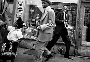
He was born on 19th April, 1928 in America. He was a French photographer and used unusual photographic techniques. One of these was working with blur as it allowed him to react instantly to something that was happening around him. Therefore the first thing he didn't use was a tripod as a result his photos had a tendency to not be straight.


The fact that this photo isn't straight (in line with the road) you can tell that he has quickly taken the photo. The blur is shown in the man who is dead centre of the photo as well as the child in to the left. The blur is due to them walking which for a normal person who is walking rather slow would be a around 80 beats per minute. The man in the black suit has obviously noticed the camera and stopped to smile which is why he is in focus.

Camera Controls


The main camera controls:

Aperture:


Large aperture = Low F Stop = Narrow depth of field

Small aperture = High F Stop = Wide depth of field

Shutter Speed: means the timing and duration of opening and closing of the shutter curtain at the back of the camera. A fast shutter speed will freeze action will slow the speed creating a blurring effect (motion blur)

The relationship between the shutter speed and the aperture


This gives the ample ISO setting.

ISO: 100, 200, 400, 800, 1600

Contact Sheet


Camera Settings:
ISO - 200
F Stop 20
Shutter Speed 1" (a second)

Analysis

This technique went really well as the go the desired effect of the motion blur. This is due to using and understanding the camera settings i was using in order to create the photos. In the first photo I tried the easiest one to capture as i could make sure that the subject was moving fast enough for the blur to work and it worked first time. This most likely happened due to the long shutter speed as it would show any movement that was made. In all the photos the background remained still and only the subject was moving. This showed good camera control as there was no camera shake. In my opinion i like how in the photo you can still make out what the subject is doing.

Will I use this technique in my work?

I may use this technique in my work in order to help blur out the people as they walk. This will allow the main focus of my work to remain still while taking out distractions like peoples faces.

Tuesday, September 24, 2019

Research Post David Gutierrez

David Gutierrez

He is a London interior and architectural photographer, he specialises in architectural photography. His style is modern, contemporary. He is interested in urban landscapes and how new structures effect the city's development. Starting in 1999 in New York is where with a analogue camera his passion grew and continued to 2002 where he moved back to London, UK. This kick started his career, switching to a digital camera in 2006. This has allowed him to photograph many cities not only London but Tokyo, Hong Kong, Bilbao and Paris. 


He has created many different series of images:

- Twilight
- Exposure
- Imitation
- Structure
- Vertical 
- Tube
- Greyscale
- Abstract
- Interior 

(https://www.davidgutierrez.co.uk/).


(From the series EXPOSURE, 'Tower Bridge, 2012, London, UK' )
(https://www.davidgutierrez.co.uk/london-photographer--architecture--streaming-light.html)

This photo is of Tower Bridge in London at night where all the lights are on. The long exposure has allowed the streams of lights created by car and busses crossing the bridge to help illuminate the photo. They also bring in colour and drama to the photo. The streak's imply movement as that is how they are created, allowing the eye to follow it into the photo. As a result the viewer can easily draw themselves into the photo.


(From the series VERTICAL, ''Work In Progress' London, UK' )
(https://www.davidgutierrez.co.uk/london-photographer--creative-photography--architecture--looking-up.html)

In this photo there is a lot of juxtaposition between the old and the new and the in progress buildings. This shows almost how the city is changing as there are the old builds right next to these new a slick skyscrapers. It gives an out with the old and in with the new feeling to the photo. The angle shows the height and the vertical lines show the grandness of the buildings. As the eyes of the viewer move up the building for some its like you cant even see the top. This can create the feeling of intimidation and fear.


(From the series GREYSCALE, 'London Bridge Station - London, UK' )
(https://www.davidgutierrez.co.uk/london-photographer--black-and-white-photography.html)

This black and white photo the grey tone allows highlighting of the structure of the stairs and escalators. The angle at which it was taken has the whole width of the stairs in view this creates the illusion that the view could step into the photo and actually walk up the stairs. As your eyes move up the photo it becomes more blurred. As a result the thought of mystery arises due to the unknown of what is at the top. The great thing about this is you know that you should end up outside by London Bridge in London due to the name of the photo.


(From the series TWILIGHT, 'Millennium Bridge and St.Paul's Cathedral 2012, London, UK' )
(https://www.davidgutierrez.co.uk/london-photographer--night-urbanscape-photography.html)

In this photo of St.Paul's Cathedral you can tell that it has been taken probably by laying down on the Millennium Bridge due to how low the photo has been taken. The height of the barriers because of the angle have become a frame enclosing the photo. The forces the viewers eyes straight down the centre of the photo, helped by the pattern on the floor as the squares are even in straight lines. The lights in the photo also have the same effect as if your eyes stray from the orange lights you then hit a barrier of blue lights. Everything in this photo is designed and taken to force the eyes of the viewer down the bridge to see the Cathedral which stands at the end highlighted with white light creating the illusion of grandness as its so strong due to the lighting being harsh.


(From the series IMITATION, 'Trafalgar Square, 2011, London, UK' )
(https://www.davidgutierrez.co.uk/london-photographer--architecture--reflections.html)

For the last photo i believe that he has taken this photo after a rainy day as he has used the reflection of the puddles to create a mirrored effect. This photo of Trafalgar Square is different to the ones you normally see. The burst of light highlighting the design and structure of the buildings really brings it forward. Then that being reflected in the stillness of the water on the floor creating this duplicate, resulting in a illusion where you could enter either side of the photo. This illusion is only broken as the tree is distorted and you can't see the water from the fountain in the reflection otherwise i think it would become extremely impossible to tell which way up the photo would have meant to be.


Influence 

EXPOSURE

VERTICAL


GREYSTYLE


IMITATION


Summary
David Gutierrez's work is a big inspiration on my work as shown above, where I used the inspiration from multiple series in order to produce my own work. I really like how different his series are and how they show me different ways to take photos. As a result I have been able to take influence from most of his series, allowing me to easily show were his influence has effected my work.

From EXPOSURE, I used the inspiration of using lights from traffic to show the use of movement. I adapted this by not having to much colour so the viewers eyes where not distracted for the parts of the photo I wanted them to be looking at.
The series VERTICAL, I didn't use the same technique of  a 360 degree view in editing as I took preference of using the height of the building to create the same effect. I did this by using the same technique of using angles.
Then the GREYSTYLE, from this series the only inspiration was to do a shoot of mine in Black and White instead of colour to see the effects that it had upon my work. I did like the effect however it wouldn't have work within some of my shoots for example where there was little light, night shoots.
Lastly IMITATION, in this shoot he used reflections within puddles to create an interesting photo. I adjusted this idea by making the reflections more chaotic and dramatic, instead of using puddles I used a mirror. The inspiration really came from the idea of reflecting the buildings to distort and create a more interesting photo.

References:


D.Gutierrez, David Gutierrez Photography, [https://www.davidgutierrez.co.uk/]


Research Post William Klein

William Klein

He is an American born French photographer and filmmaker, born in New York City. Firstly he used unusual photographic techniques in photojournalism and fashion photography. Using wide angle and telephoto shots on models outside of the studio setting. Then became widely acknowledged as an innovator in the history and design of photo books, through publish of his first book 'life is good and good for you', 1956. In this photo she captured the rough and tumble of daily life. His brutally honest images caused a sensation, leading to 3 more books published from different cities: Rome (1958 – 59), must scale (1964) and Tokyo (2014). In these books he used the idea of 'The decisive moment' by Henri Cartier - Bresson.

References

1) Howard Greenberg Gallery, William Klein, http://www.howardgreenberg.com/artists/william-klein, last assessed 24/09/19.

2) Wikipedia, 2019, William Klein, (photographer), 

https://en.wikipedia.org/wiki/William_Klein_(photographer)


Huxley parlour, Nina + Simone, Piazza Di Spagna, Rome (Vogue), 1960, [https://huxleyparlour.com/works/nina-simone-piazza-di-spagna-rome-vogue-1960/]

This photo is taken from his time at Vogue magazine, before the books about daily life in the cities were published. In this photo the model is walking down a zebra crossing, leading the viewer's eyes to follow her movement like she is able to walk out of the picture. For this time this was a very unconventional thing as it wasn't staged within a studio but taken outside in the moment on the streets. This almost gives the impression or idea of 'this is what you can look like if you wear this outfit'.

Huxley parlour, Atom Bomb Sky New York 1955, [https://huxleyparlour.com/works/atom-bomb-sky-new-york-1955/]

This next photo shows the skyline of New York City, whether empire state building is clearly visible and is always spotlighted by the background. Taken from his first photo book 'life is good and good for you', shows the viewer of image how beautiful and complex New York city looks from a high vantage point.The enormous light (the sun) lights up the city from behind creating a cast shadow as well as allowing the viewer to see into the vast distance/the horizon.

Courtesy HackelBury Fine Art, New York, 1954 – 55.

[https://www.theguardian.com/artanddesign/2014/oct/19/photographers-on-photobooks-nan-goldin-juergen-teller-martin-parr]


From the first book, this is the most famous photo. It shows Henri Cartier-Bresson's idea of the decisive moment perfectly. As the viewer can see the image is fully straight and therefore taken at that exact second in time. He shows people in mid movement going about their day, where he has been spotted the man in the black suit has smiled. This captures the feeling of busyness as he and the man in front of him both remove movement and supposedly kept going even after this photo was taken. A photo is also not framed perfectly as the building or pavement is not straight therefore shown that this was not set up or predicted.

Influence

Summary 

The influence from this photographer was quite small however led into a large part of what my work would entail in the end. This allowed me to adapt this idea that photos aren't always perfect and its ok to have some that are off angle the second example image of the photographer shows this.

His approach to composition led to the development of my idea on using the camera itself as the movement for the photo. This gave me amazing effects and a new technique when taking photos. However I unlike the photographer I didn't shoot in black and white in that shoot. 

Work Record 1

Shoot 1

Plan for the shoot:

During this shoot i am going to look at the first place for secret areas of London.

Location: Tottenham Court Road + Covent Garden 

This area is known well for food and decoration during holiday seasons however i'm going to the area as i know that it is also has a lot of ally ways. What i am going to look at is how the streets and building are on on the everyday and then later in the year maybe and Halloween / Christmas i will go back and see what the difference is.

I am planning to see what i can find in the area that is colourful as i know that most of London is rather grey in colour. Even though this area is in the middle of London it is known to be rather colourful so i may find some great areas that will contrast the dull, grey stone. As a result i am looking to find a good contrast.

Resources:
- tripod
- Nikon D3100, 18 - 55mm camera

Techniques:
- RAW shooting

Research influence

Paul Reiffer's collection ' 2016 - London in Blue '.


This photo was taken of St. Paul's Cathedral from across the Millennium Bridge, at night. The bridge forms a leading line so it pulls you into the picture by going up the bridge and into the distance where you can see St. Paul's in the light. The angle at which the picture has been taken makes it seem like the viewer could just step straight into the photo and walk up the bridge. I really like this photo as you when you see photos of London you next to never see a large amount of colour and lights. This photo completely contrasts this and makes me think about what could i find during the day that would give the same effect. 

David Gutierrez photography


This photos location is in Camden Town by the Lock at night. There is obviously the technique of Motion Blur in the photo as there is the movement of possible cars and busses. The good thing about the angle that he has taken this at is that is the road and the streams of lights have become like leading lines. As they are guiding the eyes through the photo from the spaced out ones on the left to the more condensed lights at the end of the road on the right. 

Both of the photos for my research influence are during the night in London however i am looking for the colour during the daytime in this shoot. As well as this they are quite aesthetic looking photos, as a result i am also going to keep an eye out for those sort of photos as well.

However i am thinking that later in my shoots i am going to plan one or two night shoots.

Image Bank ( 3-5 )


This image has been added to show some of the odd and colourful things that you can find in London. I am planning on finding similar streets and buildings in this first location. The coloured umbrellas cover the street creating a beautiful flow of bright colour down the street. Due to all of this it has created a bright and aesthetic looking photo.


This house in the image has been painted along with the cars. In the design you can see many different cultures, for example around the top right hand windows the sugar skulls come from mexico and the day of the dead festival. London is known to be a city of culture and i think it will be interesting to see and photograph some of the thinks that are inspired by things.

Contact sheets


Best Photos


In this photo you can see that the main focus is a tutor styled building that really brings some character to the photo. This is because these old buildings where covered with wood framing really showing the frame and structural differences between then and now. The old windows are also rather small and instead of one big piece of glass and they are broken into little rectangles. This building is really different to the normal buildings you find, shown on the right, i really liked the big contrast between the two.


In this photo there is a bright yellow bike that someone,who had just gone into this restaurant had put down in front of the plants. I saw an opportunity as the colour of the bike matched the colour of the chairs the restaurant was using outside. The bright colours are really brought out by the black wood pots and the dark green leaves of the plants within them. This photo is really aesthetically pleasing and is a splash of colour in the otherwise grey street. When i edit this photo i am going to use the healing brush to clean up the pavement as it is distracting, as well as that im going to try and really extenuate the aesthetics of the photo. So it will relate back to the same notion that my research photos have.


For this photo i really took on board both of the research photographers photos and there use of leading lines. As a result when i was framing this i made sure to have the lines on the ground at a diagonal implying movement, this creates the effect where it appears that you can just step into the photo. I also like how i have taken the photo at such an angle that you can see the repeating aches and all the colours of the signs. When i put this photo into Photoshop i am going to look at a little bit of angle correction to bring it straight.


In this photo i loved how much of a contrast the colours are to the normal areas of London. This area reminded me of the image of the house in my image back with the amount of colours used. I liked how it wasn't just the signs that were colourful but the building themselves and the windows. I kept the idea of leading lines as the diagonal lines formed by the window sills and the angle of the building. Like David Gutierrez's photo above the way i have taken the photo allows the eyes to move through, only stopping long enough to read/look at the signs.  


The final photo is of and old street in London, you can tell this because is really thin and cobble stones so most likely built in the Victorian times. It is like a forgotten street as there was nobody there and the only sign of life was the green plants and the fact the bollards had been painted as a repeating rainbow.  I really like how this photo continues the theme of leading lines. With the street and buildings curving down a hill to the left. I also took some inspiration from Paul Reiffer's photo where it was like you could step into the photo. I like how instead of stepping into the photo mine creates the feeling that you are already part of the photo.

Needs improvement


In this photo the angle at which i took the photo is what has really let it down. The only issue is that i couldn't get up high enough to take the unique shape that i wanted to. However i believe that even then it wouldn't go well with this series of photos as it lacks the idea of a leading line, not top of that there is the lack of colour. 


With this photo the angle at which i took it was the biggest issue. I think if i ever go back to this location i would retry this photo by moving further back so i wasn't looking up so much and also twisting how i was so I have a side profile as well so it not only had the vertical lines which can be intimidating but also incorporated the idea that was in the rest of the shoot.


I actually really liked this photo due to the repeating arches and how it pulled you through the photo. However the way the movement through the photo just wasn't quite right. Think what would have been a good idea would to use a long shutter speed and had people walking through it so it didn't feel as static. Possibly the way i took this photo could have had a slightly different angle as it hasn't got the feeling of being able to step into the photo like some of the others had.


In this last photo i believe that i had the wrong aperture settings due to it being slightly to dark. Also the angle isn't quite central so it doesn't quite has the same effect i was going for to mimic Paul Reiffer's photo where it was like you could step into the photo.

AO3: Record ideas, observations and insights relevant to intentions, reflecting critically on work and progress

Best Photos
In this photo you can see that the main focus is a tutor styled building that really brings some character to the photo. This is because these old buildings where covered with wood framing really showing the frame and structural differences between then and now. The old windows are also rather small and instead of one big piece of glass and they are broken into little rectangles. This building is really different to the normal buildings you find, shown on the right, i really liked the big contrast between the two.
In this photo there is a bright yellow bike that someone,who had just gone into this restaurant had put down in front of the plants. I saw an opportunity as the colour of the bike matched the colour of the chairs the restaurant was using outside. The bright colours are really brought out by the black wood pots and the dark green leaves of the plants within them. This photo is really aesthetically pleasing and is a splash of colour in the otherwise grey street. When i edit this photo i am going to use the healing brush to clean up the pavement as it is distracting, as well as that im going to try and really extenuate the aesthetics of the photo. So it will relate back to the same notion that my research photos have.
For this photo i really took on board both of the research photographers photos and there use of leading lines. As a result when i was framing this i made sure to have the lines on the ground at a diagonal implying movement, this creates the effect where it appears that you can just step into the photo. I also like how i have taken the photo at such an angle that you can see the repeating aches and all the colours of the signs. When i put this photo into Photoshop i am going to look at a little bit of angle correction to bring it straight.
In this photo i loved how much of a contrast the colours are to the normal areas of London. This area reminded me of the image of the house in my image back with the amount of colours used. I liked how it wasn't just the signs that were colourful but the building themselves and the windows. I kept the idea of leading lines as the diagonal lines formed by the window sills and the angle of the building. Like David Gutierrez's photo above the way i have taken the photo allows the eyes to move through, only stopping long enough to read/look at the signs.  
The final photo is of and old street in London, you can tell this because is really thin and cobble stones so most likely built in the Victorian times. It is like a forgotten street as there was nobody there and the only sign of life was the green plants and the fact the bollards had been painted as a repeating rainbow.  I really like how this photo continues the theme of leading lines. With the street and buildings curving down a hill to the left. I also took some inspiration from Paul Reiffer's photo where it was like you could step into the photo. I like how instead of stepping into the photo mine creates the feeling that you are already part of the photo.

AO2: Explore and select appropriate resources, media, materials, techniques and processes, reviewing and refining ideas as work develops.

For this shoot i used my Nikon DS3100 camera set to manual, with manual focusing. However I did notice that the pictures were a little grainy and i was having a bit of trouble with my camera. Due to this after this shoot i have taken it to have the mirrors and lens checked over.

The settings i used:
ISO 100
F stop 5.6 - 8
Shutter Speed 1/125 - 1/80

I had to change my shutter speed and F stop due to the continuously changing weather and due some of the locations i was in were darker than others.

AO1: Develop ideas through sustained and focused investigations informed by contextual and other sources, demonstrating analytical and critical understanding

For all of my photos i decided to import them into Photoshop in order to enhance them. For a couple of my photos i also used the camera angle correction tool. I also used hue and saturation to bring out the colour in a couple of the photos.


In this first photo i had used the Hue and Saturation tool in order to draw out some of the colour that had been dulled down due to the cloud and lack of light in the area. This idea of drawing out colour from the photo is due to David Gutierrez and how he pulls as much colour out of his photo as he can.


Another thing that i did to this photo was to change the angle through angle correction as the angle wasn't quite straight. As a result it creates the feeling of possibly being able to step into that area. As well as this it also makes the leading lines straighter.

BEFORE


AFTER


I repeated this technique with this photo and also added in some straight lines so you could see the before and after  the correction.

Screenshots taken using the Snipping tool

AO4: Present a personal and meaningful response that realises intentions and, where appropriate, makes connections between visual and other elements.


Progression

Within this shoot there is a lot of uses of different lines: leading, vertical, aches, S and C curves. These lines are all applying movement and as a result at my next location i am going to see the types of photos i can create with the idea of these different lines from AS photography in mind. For this i think i am going to use 'The City of London' in order to do this shoot. This is because there are a lot of new buildings as well as old buildings. As a result i am going to still look for the odd things to find with in that area however also look a little at the lines and how they are affecting the photo more.

What i am looking for:
- Different places to the normal
- Different uses of Lines: Vertical, Leading, Horizontal, Diagonal, S and C curves, Arches
- The use to movement through a photo